after what has seemed like a drought meant to crush my soul, the image tags have been restored on the cyber nations forums!!!! YAAAAAAAAAY!!! really, turning them off was meant to prevent put-out players and banned members from going all 4chan on the forums again, as some of these children are wont to do when they get pissed at the game. but, regardless of the reason, it meant that a) the forums have been much less fun as a community, and b) my nation's main source of income (aside from taxes) has DIED. no image tags = no new sig images and much fewer new flags. and at $3 million a pop, i NEED those commissions!!! that's two days' worth of bills for my nation. in praise of admin, i share some of my favorite signatures i've ever made........


i know these are very simple, but i love them. simplicity makes me happy. just as with cooking, i think it's much, much more difficult to turn out a solid product using only simple ingredients than with a bunch of fancy or flashy ones. i also believe that lettering is key. i am a
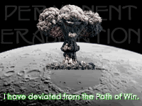
fanatic for fonts. i will never settle for a font that almost conveys what i want, but doesn't quite make it. i have spent countless hours searching font sites and databases for JUST the right font. i have given myself headaches over the quest, on many occasions. the font makes or breaks an image, for me. in these cases, i definitely feel the font IS the image, and it totally works. makes me want to squee. >.>


these were made for my husband, jim- or, overlord jim, as he is known in-game. the first one of these was one of the first images i ever made for someone. really, the hard part for me here was extracting the image of the Roman general he wanted me to use. this was a new technique and challenge for me, and i had a very hard time with it. i think it came out well, though. the background i used is from one of my favorite zones in guild wars, the northern shiverpeaks. i think, actually, that i'd like to go back into the .psd of this sig and fine tune things a little, now that i'm more experienced with extraction- as evidenced by the second sig. i spent DAYS digging through screen captures from old generation one transformers episodes, looking for just the right shot of each one. jim specified which autobots he wanted, but he had no specific image in his head of what he wanted for the final product- just knew he wanted a transformers sig, and whom he wanted in it. it was during this project that i discovered defringing. god bless that little button. this was also one of the first times that an image appeared in my head of the desired finished product, and i was absolutely able to create it. that's been a strugle for me, especially through my years of wanting desperately to draw and paint but being unable to put anything on the paper that looked recognizable, let alone like what i wanted. so this sig was a triumph for me, without any questions.

this was not so much a commission, as an entry into a sig contest. the guy who put up the request for a sig didn't pick it, but i don't care. i know that i was the only person who responded who took his individual requests into consideration, and that makes me content. i don't make sigs for other people to create what *I* want to create, but what THEY want. i serve them, not myself, in this aspect of my creativity. he wanted a picture of the hindenburg- NOT burning- and he wanted black, white, and red. the text was also his exact choice. what was truly mine, though, was how i made the black and white happen. this image is a very careful cropping of a beautiful painting of the hindenburg flying over new york city, with an escort of biplanes. the colours of the painting were very warm and comforting and beautiful- rose and pink and orange and gold and purple and blue, all soft and glowy and warm. not quite the feel we were going for, though.... a quick flip to grayscale helped, but it looked too flat and empty then. this led to my first real delving through the layer effects available to me. i don't recall off the top of my head which this one was, but it absolutely made it what i wanted. the warm, glowy, nostalgiac painting became the grainy, fuzzy, dark piece i desired. the dark red of the text enhanced that feel, and i am truly pleased with the result. i could care less if lord jude didn't pick it- i know i made what he asked for. *insert big stupid grin here*
only in photography and in graphics have i ever been able to so completely take a desire within me and bring it to fruition so accurately- and very thing other things in my life are this deeply satisfying. i hope that i am interpreting this as i am meant to. i have to believe i am.